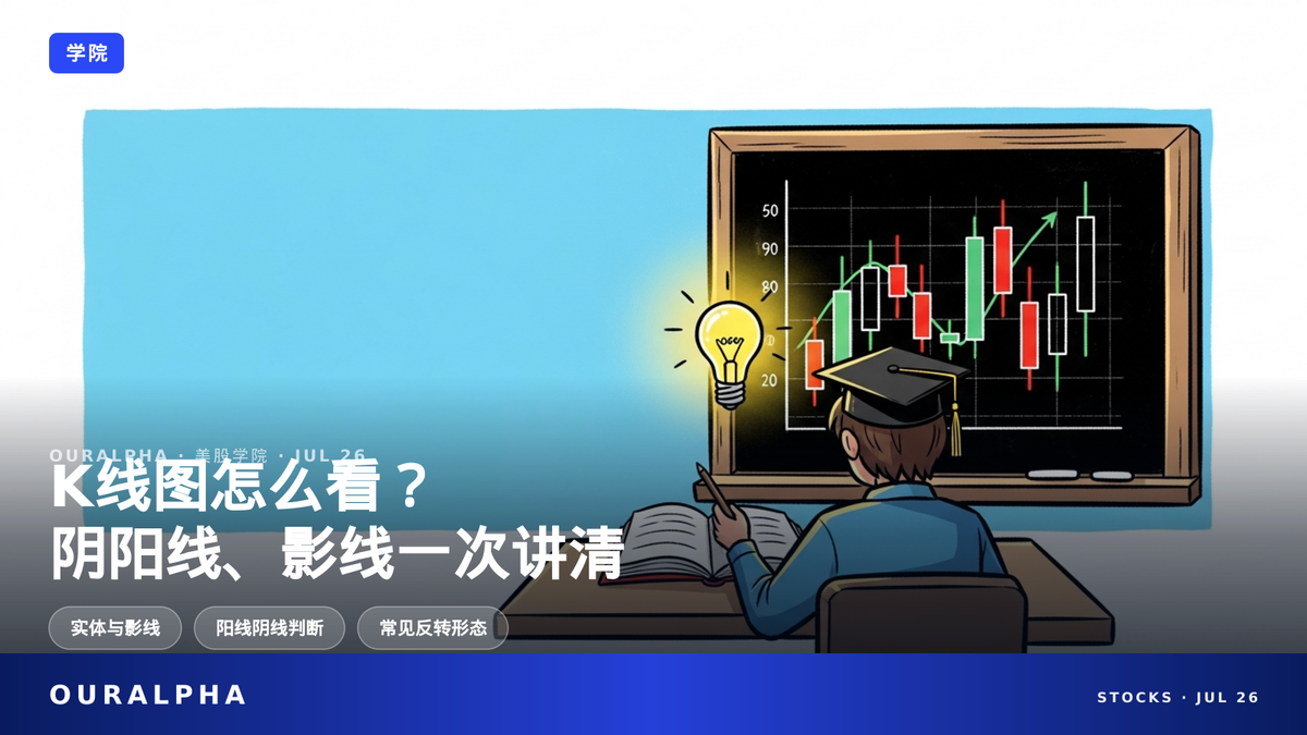
How to Read Candlestick Charts? Bullish/Bearish Candles and Wicks Explained Simply

Candlestick charts show open, high, low, close using body and wicks. A bullish candle has close > open; a bearish candle has close < open. The longer the wick, the more intense the battle between buyers and sellers.

How to Read Candlestick Charts? Bullish/Bearish Candles and Wicks Explained Simply
OURALPHA · ACADEMY

How to Read Candlestick Charts?
Bullish/Bearish Candles and Wicks Explained Simply

OurAlpha Academy · Learn Candlestick Charts from Scratch

Open your trading app and see a screen full of red and green candles—do you know what they mean?

Candlestick charts are the most basic tool in technical analysis, but many people get confused by the colors at first.

Actually, understanding candlesticks only requires four numbers: open, close, high, and low.

TL;DR · IN SHORT

  • Candlesticks show open, high, low, close using body and wicks. A bullish candle has close > open; a bearish candle has close < open.
  • The longer the wick, the more intense the battle between buyers and sellers.
  • Single or multi-candle patterns are only probabilistic signals—always confirm with other indicators.

KEY TERMS

Candlestick Chart: A price chart that uses 'candle' shapes to display four data points (open, high, low, close) for a given time period. Originated from Japanese rice trading.

Body: The wide rectangular part of a candlestick, representing the price range between the open and close for that period.

Wick / Shadow: The thin lines extending above and below the body, showing the highest price (upper wick) and lowest price (lower wick) reached during the period.

Bullish / Bearish Candle: A candle where the close is higher than the open is called a bullish candle (price up); a candle where the close is lower than the open is called a bearish candle (price down).

CONTENTS

  1. What Exactly Is a Candlestick Chart?
  2. What Do Candle Colors Mean? Red for Up, Green for Down, or Vice Versa?
  3. What Do the Body and Wicks Represent?
  4. What Does a Doji Candle Indicate?
  5. How to Tell a Hammer from a Shooting Star?
  6. What Are Engulfing Patterns and Morning Star?
  7. Can You Accurately Predict Stock Prices Using Only Candlestick Patterns?
  8. FAQ

What Exactly Is a Candlestick Chart?

A candlestick chart, also called a candle chart, is one of the most commonly used price charts in technical analysis. It uses a single 'candle' to display the open, high, low, and close prices for a given time period (e.g., 1 minute, 1 day, 1 week)[1]. Simply put, one candlestick is a 'price snapshot' for that time unit. Think of it as taking a photo every period, recording where the price started, where it ended, and the highest and lowest points in between.

Compared to a simple line chart (which only connects closing prices) or a bar chart (which marks open and close with horizontal ticks), candlestick charts are more popular among traders because their colors and shapes are easy to read at a glance[11]. A line chart only shows you the change in closing price, missing the intraday price fluctuations. A bar chart also shows open, high, low, close, but it's not as intuitive as a candlestick. The combination of a candle's 'body' and 'wicks' tells a little story about who had the upper hand between buyers and sellers.

What Do Candle Colors Mean? Red for Up, Green for Down, or Vice Versa?

Many people get confused by candle colors at first: in some software, red means up and green means down; in others, it's the opposite. In reality, colors are just a display preference set by the software—there's no fixed rule[3]. It's like driving on the left in some countries and on the right in others, but the rule itself is consistent.

The only standard for determining a bullish or bearish candle is: if the close is higher than the open, it's a bullish candle (often shown in green or white to indicate a price increase); if the close is lower than the open, it's a bearish candle (often shown in red or black)[3]. You can freely set the colors in your trading software, so don't let the colors mislead you—focus on whether the close is higher or lower than the open. For example, if a candle's close is ¥100 and its open is ¥95, it's a bullish candle, regardless of whether the software displays it as red or green.

What Do the Body and Wicks Represent?

A candlestick consists of two parts: the body and the wicks. The body is the wide rectangular part in the middle, representing the price range between the open and close[2]. If the body is long, it means the price moved significantly; if the body is short, the open and close were very close. Think of the body as the 'battle result': a long bullish body means buyers won big; a long bearish body means sellers won big.

The wicks are the thin lines extending above and below the body: the top of the upper wick is the highest price during the period, and the bottom of the lower wick is the lowest price[2]. The longer the wick, the wider the price range and the more intense the struggle between buyers and sellers[4]. For example, a candle with a very long upper wick means the price shot up high but was pushed back down by selling pressure, leaving a 'long tail.' If a candle has almost no wicks, it means one side (buyers or sellers) dominated the entire period, and the price moved almost in a straight line.

What Does a Doji Candle Indicate?

A Doji is a special candlestick: the open and close are almost the same, the body is extremely small or even nonexistent, making it look like a cross or plus sign. It represents a near balance between buyers and sellers, with the market in a state of indecision[5]. Imagine a tug-of-war where both sides are equally strong and the rope barely moves—the Doji reflects that stalemate.

If a Doji appears at the end of a clear uptrend or downtrend, it may signal a potential trend reversal. But note: a Doji itself is just a 'warning'—it needs the next candle to confirm the direction[5]. For example, if a Doji appears after an uptrend and the next candle closes lower, the reversal is more likely. If the next candle continues to rise, it might just be a temporary pause.

How to Tell a Hammer from a Shooting Star?

A Hammer typically appears at the end of a downtrend: it has a small body at the upper end of the price range, a very long lower wick (at least twice the body length), and little or no upper wick. It shows that sellers once pushed the price very low, but buyers managed to pull it back near the open—a potential bullish reversal signal[6]. The name is vivid: like a hammer, with the head (body) on top and the handle (lower wick) below, suggesting the market 'hammered out' a support at the bottom.

A Shooting Star is the opposite, appearing at the end of an uptrend: a small body at the lower end of the price range, a very long upper wick, and little or no lower wick. It shows that buyers once pushed the price very high, but sellers then drove it back near the open—a potential bearish reversal signal[7]. It looks like a shooting star streaking across the sky, with the upper wick as its trail, hinting that upward momentum is fading. Both patterns need confirmation from the next candle.

What Are Engulfing Patterns and Morning Star?

A Bullish Engulfing pattern consists of two candles: first a bearish candle, then a bullish candle whose body completely covers (engulfs) the body of the previous bearish candle. It usually appears at the end of a downtrend, indicating that buyers have overpowered sellers[8]. It's like a battle: on day one, sellers win; on day two, buyers not only win back but also occupy all of the sellers' territory.

A Bearish Engulfing pattern is the opposite: first a bullish candle, then a bearish candle whose body engulfs the bullish one, signaling weakening upward momentum[9].

The Morning Star is a three-candle pattern: first a long bearish candle (continuing the downtrend), second a small-bodied star candle that gaps down, and third a long bullish candle (closing more than halfway into the first bearish candle's body). It is often seen as a signal that a downtrend is bottoming out[10]. It's like the darkness before dawn: first a big bearish candle (night), then a small star (first light), and finally a big bullish candle (sunrise).

Can You Accurately Predict Stock Prices Using Only Candlestick Patterns?

No. Candlestick patterns are essentially empirical rules based on historical prices—they are not absolute prediction tools[13]. Just like a weather forecast saying 'dark clouds may bring rain,' sometimes the clouds clear up. Professional educational resources generally advise that candlestick signals should be combined with volume, support/resistance levels, or other technical indicators like RSI or MACD for confirmation. Relying solely on a single pattern for trading decisions carries a high risk of false signals[13].

Also, candlesticks can be applied to any time frame—1 minute, 5 minutes, daily, weekly—and the same price movement can look different on different time frames[12]. For example, a daily chart might show an uptrend, while a weekly chart might show just a consolidation. So, candlestick charts are a great analysis tool, but not a crystal ball. Traders should use them as a reference, not the sole basis for decisions.

常见问题 FAQ

What's the difference between a candlestick chart, a line chart, and a bar chart?

A line chart only shows closing prices connected by a line, providing the least information. A bar chart shows open, high, low, close but uses horizontal ticks, which is less intuitive than candlesticks. Candlestick charts use colors and shapes to make the data easy to read at a glance[11].

When looking at a candlestick, which should I look at first—the body or the wicks?

The body reflects the final outcome of the battle between buyers and sellers (determining direction and strength), while the wicks reflect the price fluctuation process during the period (whether there were obvious struggles or reversals). Combining both gives you the full price story behind a single candle[2][4].

Doji, Hammer, and Shooting Star all look like 'small bodies.' How can I quickly tell them apart?

Key is the position of the body within the price range and the direction of the wicks: a Doji has almost no body, indicating a stalemate; a Hammer has a body at the upper end and a long lower wick, appearing at the end of a downtrend; a Shooting Star has a body at the lower end and a long upper wick, appearing at the end of an uptrend. They look similar, so you need to consider the trend context to distinguish them[5][6][7].

If I see an Engulfing pattern or Morning Star, should I immediately buy or sell?

It's not recommended. These patterns, like other candlestick signals, are only probabilistic reference signals, not precise entry or exit points. A safer approach is to wait for the next candle to confirm the direction and combine with volume, support/resistance, and other information before making a trade—not placing an order as soon as the pattern appears[8][9][10][13].

Besides candlestick patterns, what other indicators should beginners look at when deciding when to buy or sell?

Professional educational resources generally suggest that candlestick signals should be verified together with volume, support/resistance levels, or technical indicators like RSI and MACD. Relying solely on a single candlestick pattern for trading decisions carries a high risk of false signals[13].

Why does the same price movement look different on candlestick charts of different time frames?

Because candlesticks can be applied to any time frame—1 minute, 5 minutes, daily, weekly—and the resulting patterns differ. For example, the same movement might appear as an uptrend on a daily chart but just a consolidation on a weekly chart. So before reading candlesticks, you need to know which time frame you're looking at[12].

Are candlestick charts suitable for long-term investing or only for short-term trading?

Candlesticks can be applied to any time frame, so they work for both long-term and short-term. However, regardless of the time frame, it's recommended to use candlestick patterns as a reference rather than the sole basis, and confirm with other indicators[12][13].

SOURCES

[1] CME Group Education: Chart Types — Candlestick, Line, Bar
[2] CME Group Education: Chart Types — Candlestick, Line, Bar
[3] Nasdaq: The Trader's Flashlight in a Market Fog — What are Candlestick Patterns?
[4] CME Group Education: Chart Types — Candlestick, Line, Bar
[5] Investopedia: What Is a Doji Candle Pattern, and What Does It Tell You?
[6] Investopedia: Hammer Candlestick Pattern
[7] Investopedia: Shooting Star Candlestick
[8] Investopedia: Bullish Engulfing Pattern
[9] Investopedia: Bearish Engulfing Pattern
[10] Investopedia: Morning Star Candlestick Pattern
[11] CME Group Education: Chart Types — Candlestick, Line, Bar
[12] Nasdaq: Overview of Single Candlestick Patterns
[13] Nasdaq: Overview of Single Candlestick Patterns

This content is for informational purposes only and does not constitute investment advice, trading advice, or any guarantee of returns.

Keep Reading

What Are Moving Average Golden Cross and Death Cross? Usage and Risks Explained

What Are Moving Average Golden Cross and Death Cross? Usage and Risks Explained
OURALPHA · ACADEMY

Moving Average Golden Cross & Death Cross:
Are They Signals to Buy the Dip or Sell the Top?

OurAlpha Academy · Technical Indicators for Beginners

Golden Cross and Death Cross are the most common moving average signals in technical analysis. They sound powerful, but do you really know how to use them?

They are actually lagging indicators—they only confirm a trend after it has happened, not predict the future.

This article explains the principles, usage, and common pitfalls in plain English, so you won't

Read full story →

Stay ahead of the market — never miss a deep dive

Follow OurAlpha for AI-driven US equity research and market insight, every day.